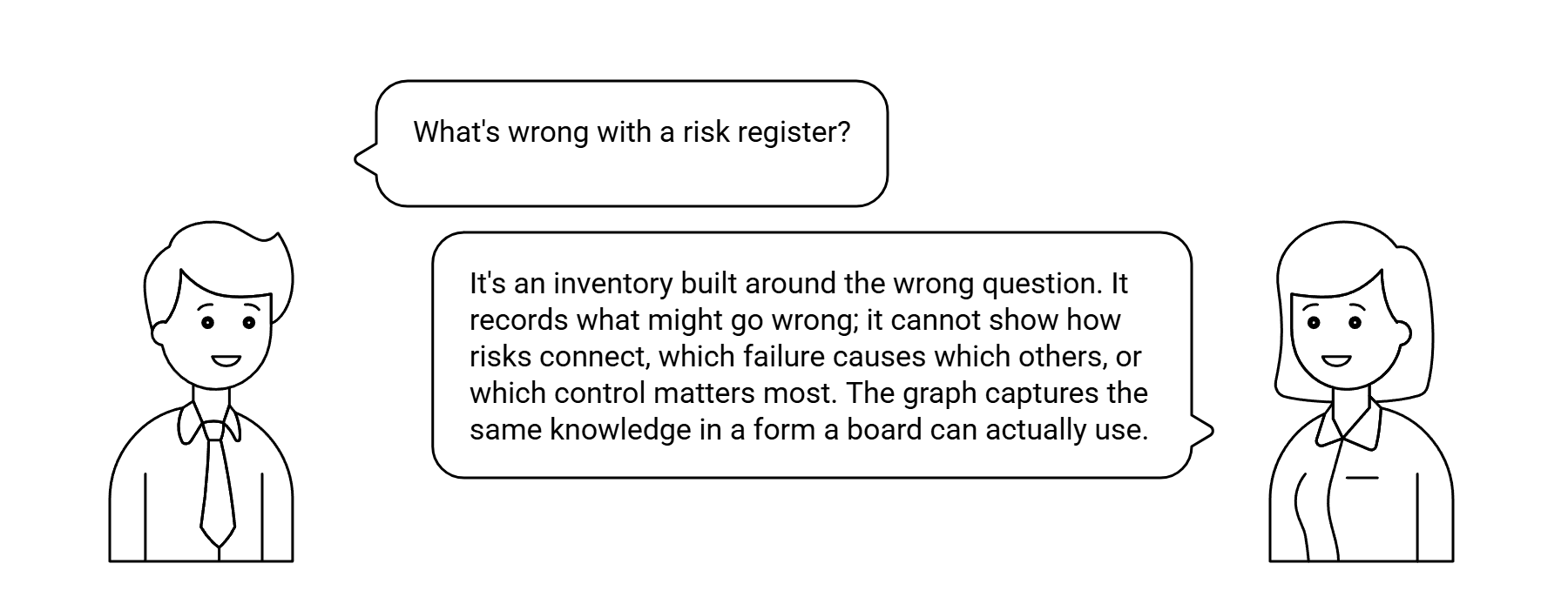
Every board question that matters is unanswerable by a risk register. Not because the register is poorly maintained — because it is the wrong kind of object.
You do not build the entire graph at once. You start with the decision that hurts the most — the one where the register gives no guidance — and build just enough causal structure to support that decision. Then you expand. A 200-row register converted directly into a 200-node graph is unmanageable and, worse, preserves the register's structural problems, because the register's rows were not organized by causal logic in the first place.
Step 1 — Start With a Decision
| Domain | The decision | Why the register fails it |
|---|---|---|
| Insurance | Renew this coastal portfolio at current rates, increase 15%, or non-renew? | The register lists “coastal storm risk” as a single row with a score. It does not model how building age, elevation, construction type, and climate trend interact to produce loss — or how a rate increase feeds adverse selection. |
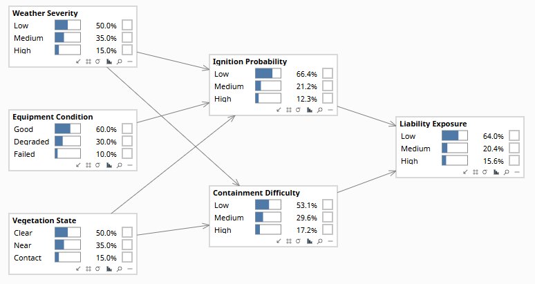
| Utilities | Replace this transformer now, at the next scheduled outage, or run to failure? | The register lists “transformer failure” as a single row. It does not model how loading, temperature, oil quality, and age combine to produce failure probability at different time horizons. |
| Financial services | Approve this $50M credit facility? | The register lists “credit risk” as a category. It does not model how industry conditions, borrower leverage, interest rates, and collateral values interact to produce default probability. |
| Manufacturing | Single-source this critical component or maintain two suppliers at higher cost? | The register lists “supply chain disruption” as a single row. It does not model how supplier geography, financial health, logistics routing, and demand variability interact to produce disruption probability and severity. |
The decision defines the scope. You do not need to model every risk in the register — just the ones causally relevant to this decision. That is typically 10–25 variables, not 200.
In practice, the first causal graph uses about 10% of the register's rows — but it answers 100% of the question the register could not. The remaining 90% of the register either feeds into future graphs as scope expands to other decisions, or turns out to be symptoms and consequences better modeled as downstream nodes than as independent risks. The register was listing effects as if they were causes. The graph corrects this.
Step 2 — Cluster by Cause, Not by Category
Take the register rows relevant to the decision identified in Step 1. Sort them into three groups:
This sorting exercise almost always reveals that the register has been listing mechanisms as if they were root causes (“building age” listed as a risk rather than as a mechanism connecting construction era to material condition to flood damage), and consequences as if they were independent risks (“reputational damage” listed separately from the cyber event that causes it). The act of sorting exposes the structure already implicit in the experts' knowledge.
A register row that cannot be sorted into root cause, mechanism, or consequence without ambiguity is usually a conflation — it is doing two different causal jobs simultaneously. “Supply chain concentration risk” might be both a root cause (high dependence on a single supplier) and a mechanism (that dependence amplifies the impact of the supplier's financial deterioration). Separating these into two nodes — one for the structural feature, one for the transmission mechanism — produces a graph that can reason about each separately. The register could not.
Step 3 — Draw the Arrows
The arrow-drawing session requires domain experts in the room. It is a structured reasoning exercise, not a data analysis task. The facilitator's job is to enforce two rules:
Every arrow requires a mechanism
For every proposed arrow from X to Y, the expert must complete the sentence: “X causes Y because …” If the answer is “they tend to go together” or “in our experience they're connected,” the arrow is a correlation observation, not a causal claim. Push for the mechanism: “through what process does X affect Y? What would have to be true for X to change Y?” If the expert can answer this, the arrow belongs. If they cannot, the arrow does not — at least not yet.
Every missing arrow is an independence claim
The absence of an arrow between X and Y is a claim that X does not directly cause Y — that any association between them runs through other variables already in the graph. This claim is as important as the presence of an arrow, and it is equally testable. When experts disagree about a missing arrow, the facilitator records both positions and flags the edge as uncertain. The VOI of resolving that uncertainty can be computed once the graph is drafted.
Common patterns that emerge in this session:
- Confounders become visible: two variables that were listed as independent risks in the register are revealed to share a common upstream cause. The correlation between them is not causal — it is a consequence of the shared parent. This matters for intervention design: addressing one will not affect the other.
- Mediators emerge: experts identify intermediate variables that were not in the register at all, because the register never needed to name the mechanism. These mediators are often the most actionable nodes — they are the levers.
- Feedback loops surface: the experts recognize that X causes Y and Y causes X, which is a cycle. Individual Bayesian networks must be acyclic — the facilitator's job is to time-slice the cycle (X at time t causes Y at time t+1, which causes X at time t+2) or to identify which direction of causation is dominant at the decision's time horizon.
Step 4 — Quantify the Edges
You do not need precise probabilities for every edge on the first pass. Run a sensitivity analysis: which conditional probability parameters does the decision depend on? If the optimal action does not change whether P(flood damage | storm, old building) is 0.15 or 0.35, do not spend time refining that estimate. If the decision flips at 0.25, that is the parameter to quantify carefully. This approach — guided by the Value of Information framework — is dramatically more efficient than populating every cell with equal precision, and it directs quantification effort to exactly the parameters that determine what the organization should do.
In practice, the first version of the model combines all three sources: data where available, expert judgment where data is sparse, and literature as a cross-check. The model is useful from day one, even with limited data, because the Bayesian framework is designed for exactly this combination. As more data arrives, the model updates and the expert priors wash out. But the decision-support capability does not wait for full calibration.
Step 5 — Validate, Use, and Expand
| Phase | Activity | How | Output |
|---|---|---|---|
| V1 | Structural review | Present the graph to domain experts who were not in the original session. “Does this make sense? What's missing? What's wrong?” Independent challenge is the strongest structural test. | Revised graph with documented challenges and resolutions |
| V2 | Data consistency | Test the conditional independence claims implied by the graph against available data. If the graph says X and Y are independent given Z, check whether the data agrees. D-separation tests and partial correlations. | List of structural claims consistent or inconsistent with data |
| V3 | Predictive check | Enter evidence from historical cases and compare the model's posteriors to actual outcomes. Calibrate where prediction error is systematic. | Prediction error log. Parameter adjustments where needed. |
| V4 | Decision test | Use the model for a real decision — or shadow a real decision already being made. Compare the model's recommended action to what was actually done and what actually happened. | Decision log with model recommendation, actual decision, and outcome |
Expanding the graph — not replacing it
The first graph supported one decision. To support the next decision, extend the graph — do not build a new one. Add nodes and edges that connect the new decision's variables to the existing structure. Over time, the graph grows into an interconnected model of the organization's risk landscape, each node added because it supports a specific decision, each edge justified by a named mechanism.
This is the opposite of the register approach, where risks accumulate without structure. In the causal model, every addition connects to what is already there. The graph does not just grow — it becomes more powerful with each addition, because each new node adds information to the existing nodes through the dependency structure.
The register remains as an inventory — a catalog of what has been identified. Its role changes: instead of being the analytical tool (which it was never suited to be), it becomes the input list for the causal model. Risks in the register that are not yet in the graph are candidates for inclusion as the model expands. The register tracks what you know about. The graph represents how it connects. Neither replaces the other.
The knowledge needed to build the first graph already exists in your organization. The people who built the register know the mechanisms. The graph makes that knowledge computable and permanent.
info@rung3.ai