The Paradox
A university is accused of gender bias in admissions. The aggregate data shows women are admitted at a lower rate than men. But when the data is broken down by department, women are admitted at a higher rate than men in every single department. Both statements are true. They are describing the same data.
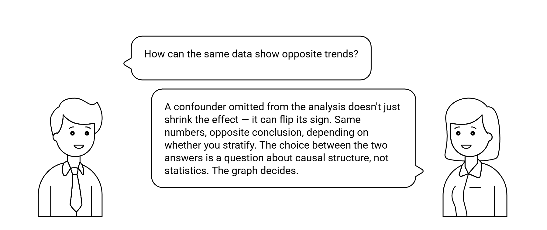
This is not a statistical anomaly. It is a structural consequence of a confounder — in this case, the fact that women disproportionately apply to more competitive departments. The confounder (department selectivity) causes both the treatment variable (gender distribution of applicants) and the outcome variable (admission rate). Adjusting for department removes its confounding effect and reverses the apparent finding.
The paradox is not that the data is misleading. It is that the aggregate analysis answers a different causal question than the stratified analysis — and the wrong question produces the wrong answer.
The Causal Explanation
In causal terms: the aggregate analysis is conditioning on the wrong set of variables. It omits the confounder and produces a biased estimate of the causal effect. The stratified analysis adjusts for the confounder — not because stratification is always correct, but because in this case the confounder is correctly identified and blocked.
The back-door criterion (see Causal Identification) formalizes exactly when stratification produces the correct causal estimate and when it does not. Stratifying on a mediator, for example, blocks the causal path and understates the true effect. Stratifying on a collider opens a spurious path and introduces bias. The correct adjustment set requires the causal graph — not intuition about which variables seem relevant.
The practical rule: whenever an aggregate result contradicts a stratified result, the first question is not "which is right?" It is "what is the causal graph, and which analysis adjusts for the correct set of variables?"
Why It Matters
Simpson’s Paradox appears wherever selection is non-random across subgroups — which is nearly everywhere in enterprise data. Treatment assignment, customer segmentation, portfolio composition, clinical prescription — all of these produce aggregate statistics that can be reversed by the right stratification.
The implications for the cases on this site: the Bank Churn case rests on exactly this structure — customers retained by the campaign were not randomly selected, so the aggregate retention rate overstates the campaign’s causal effect. The Statins case involves confounding by indication — sicker patients are more likely to be prescribed, producing an apparent negative effect that is the opposite of the true causal effect.
A causal graph makes Simpson’s Paradox impossible to overlook — because the confounder is a node in the graph and its omission from the adjustment set is a structural error, not an oversight.
If your aggregate analysis contradicts your segment analysis — or if you have never checked — the causal graph already shows why.
info@rung3.ai