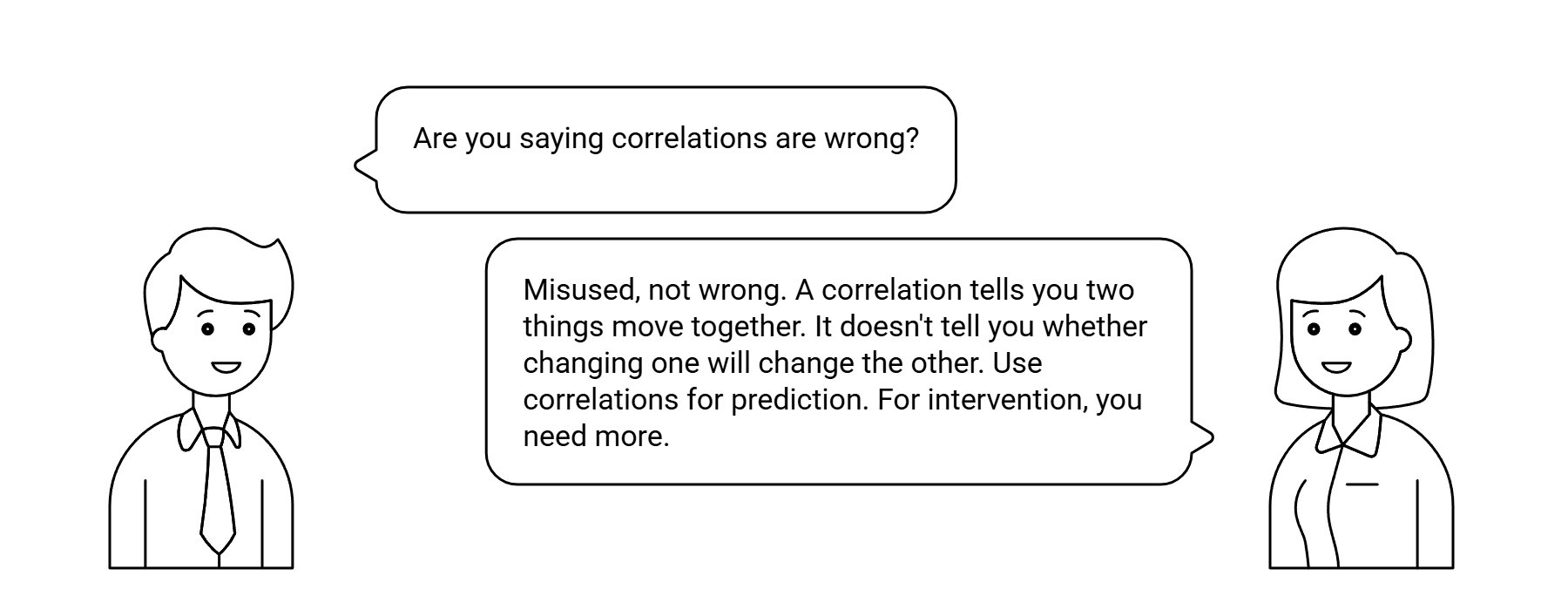
A correlation between two variables is consistent with at least six different causal structures. Knowing which one is true requires more than the data.
This is the reason a structural causal model is necessary, not optional. The graph supplies the structure that the correlation alone cannot recover.
Six structures
If you observe that A and B vary together — the price of one stock moves with another, patients on a drug have a different outcome from patients not on it, regions with more of X have more of Y — one of these is happening:
The intuitive reading. Often wrong, sometimes right.
The same correlation, reverse direction. The data does not tell you which.
Feedback loops, equilibria, mutual reinforcement. Neither variable is a clean upstream cause of the other.
A third variable C drives both A and B. The correlation between A and B is real but neither causes the other. Confounding.
A and B are independent in the population, but the process generating your sample selects on both, creating a correlation that is real in the data but absent in the world. Survivorship bias, selection bias, collider bias.
A coincidence in finite data, or a definitional link — temperature and average molecular kinetic energy aren’t connected by causation; they are the same quantity, named twice.
Six structures, one correlation. The data does not distinguish them.
What it takes to distinguish them
Identifying which structure is true requires bringing something other than the data. The full toolkit, in increasing order of strength:
- Temporal precedence. Which variable changed first? If A consistently moves before B, B-causes-A is ruled out. Necessary, not sufficient.
- Mechanistic theory. A domain expert says “the only known biological pathway runs from A to B.” This narrows the candidate graphs.
- Longitudinal data. Repeated measurements over time, with structure in how the variables evolve. Sometimes enough to rule out static common-cause stories.
- Natural experiments. A real-world shock that perturbs A without touching B’s other causes — a policy change, a regulation, a weather event. The pattern of what moves and what doesn’t reveals the structure.
- Instrumental variables. An observable that affects A and is plausibly independent of B’s other causes. Powerful when found; often hard to defend.
- Intervention or experiment. Force A and observe B. The gold standard, when ethical and feasible.
- Causal graphical modeling. Encode the candidate structures as DAGs, identify which observable patterns each predicts, and use the data to discriminate. The framework that organizes everything else.
None of these come from the data. They come from the world.
A worked example
Ice cream sales correlate with drowning deaths. Patterns of ice cream sales over a year predict patterns of drowning. The correlation is real, replicable, and statistically significant.
Neither causes the other. A common cause — hot weather — drives both. People eat more ice cream in summer; people swim more in summer; some of those swimming trips end in drowning. The correlation is structure 4 (common cause), not structure 1 (A causes B).
No machine learning algorithm given only the ice cream and drowning data can recover this. The structure has to be supplied from outside — from a domain expert who knows about weather, or from common sense, or from a graph that explicitly includes the season as a third variable. With the structure, the correlation is explainable: ice cream and drowning are conditionally independent given temperature. Without the structure, the correlation is dangerous to act on. A naive intervention — banning ice cream sales to reduce drownings — would have no effect on drownings, and would be paid for by ice cream vendors, lifeguards, and journalists asking what the analyst was thinking.
Patients who took a new drug have lower 30-day mortality than patients on standard care. Two structures fit the data equally well: (1) the drug causes lower mortality, or (4) sicker patients were preferentially placed on standard care because clinicians worried the new drug might be too aggressive for them. Confounding by indication.
The same observed correlation supports both stories. The naive analysis credits the drug; the realistic analysis adjusts for the indication and may find the effect disappears, or reverses. The Pharmacovigilance case study works through this exact pattern in detail. The e-value from sensitivity analysis quantifies how strong an unmeasured confounder would have to be to overturn the conclusion.
Why this matters for AI
Modern AI tools — large language models, predictive analytics, machine learning — learn correlations. Many of them learn correlations spectacularly well. None of them learn structure, because structure is not in the data.
An LLM trained on every paper ever written on ice cream and drowning will reproduce the correlation, in fluent prose, with confidence. It will not tell you the correlation is structure 4 unless someone has explicitly written that down. A predictive model trained on patient records will find the drug-mortality association and can be used to predict outcomes; it cannot tell you whether the association is causal without the analyst supplying the graph that distinguishes structure 1 from structure 4.
This is the reason a structural causal model is necessary, not optional. The graph encodes the human judgment that converts a correlation pattern into a causal claim. The data calibrates the parameters; the graph supplies the structure. Take away the graph and you have probabilities without a story — Rung 1 forever, no path to Rung 2 or 3.
Most decisions are made on the assumption that correlation means structure 1. A causal audit names which of the six structures actually fits.
info@rung3.ai