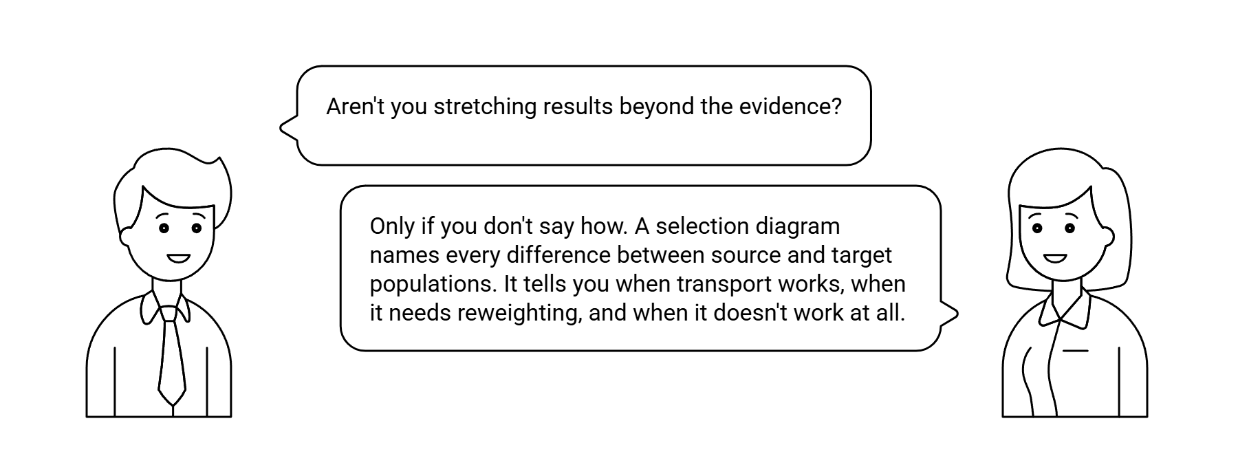
The selection diagram — due to Bareinboim and Pearl (2011, 2014) — encodes the assumed differences between two populations as a graph. It tells you, mathematically, when a result transports and when it does not.
Transportability is a property of the selection diagram, not the data. The same trial supports transport under one diagram and fails under another.
The transport problem
You have two populations: the source, where the study was done, and the target, where you want to apply the result. Some causal quantity has been estimated in the source — say, the effect of a drug on 12-month survival. The question is: does the same number apply in the target?
Naively, no — populations differ. But the structural assumption is finer than that. Populations can differ in two very different ways:
- Covariate distributions. The source enrolled younger, healthier patients; the target is older and sicker. The mix of patients is different.
- Causal mechanisms. The drug acts through a pathway that depends on something population-specific — genetic background, concurrent infections, environmental exposure. The drug works differently in the two populations.
The first kind of difference is solvable: if you know how covariates differ, you can reweight the source data to match the target distribution, and the source effect transports. The second kind is intractable in the worst case: if the drug’s mechanism itself differs, no amount of reweighting recovers the right answer — you would need a new trial in the target population.
The clinical question becomes: which kind of difference are we dealing with? Transportability theory’s answer: encode the assumed differences in a graph, and check whether the target effect is identifiable from the source data plus that graph.
The selection diagram
The technical innovation, due to Pearl and Bareinboim (2011), is the selection diagram — a DAG with one extra node, conventionally called S (for “selection” or “source”), that points into every variable whose distribution might differ between source and target.
If S points into Age, that means: “the source and target populations have different age distributions.” If S points into the drug’s mechanism node — the structural function determining outcome from treatment — that means: “the drug works differently in the two populations.” The first is just population mix; the second is a mechanism difference.
What S does not point into is equally important. The absence of an arrow from S to a node says: “this part of the causal structure is the same in both populations.” That is a substantive assumption a domain expert has to make and defend.
What makes a selection diagram different from a regular DAG is the explicit S node and the discipline of drawing every assumed cross-population difference as an arrow from S. Edges from S are differences. Absent edges from S are invariances. The diagram forces both into the open, so they can be argued about.
In the Drug Repurposing case study on this site, the canonical example: S (Selection: Trial_RA vs Target_CV) points into Age, BaselineRisk, Comorbidities, and ConcomitantMeds — the trial enrolled a younger, lower-risk population than the CV target. There is no arrow from S to InflammatoryActivity or Outcome_12mo. That absence is the substantive transport assumption: the drug acts on outcomes through the same biological mechanism in both populations; the populations only differ in their covariate distributions.
If a cardiologist disagrees — “no, this drug works through inflammation pathways that look different in CV versus RA patients” — they are saying we should add an arrow from S to a relevant mechanism node, which would change whether the effect is transportable at all. The diagram makes that argument concrete.
When transport works
Given a selection diagram, Bareinboim and Pearl (2012, 2014) proved a complete algorithm — the “do-calculus + selection nodes” extension — that decides whether a target-population causal effect is computable from source data plus the graph. If the algorithm succeeds, it returns a transport formula expressing the target effect in terms of source-population conditional probabilities and target-population covariate distributions. If it fails, no amount of cleverness will bridge the gap.
If S points only into pre-treatment covariates and never into the mechanism, the transport formula is essentially: “estimate the conditional treatment effect within strata of the differing covariates in the source, then reweight to the target covariate distribution.” This is what most epidemiologists do informally when they “adjust for” differences. The theory makes precise which covariates need to be adjusted, and whether the adjustment is sufficient.
The harder case: if S points into a mechanism, the effect may still be transportable, but only with additional assumptions — for instance, if the mechanism difference is mediated by an observable variable. The graph tells you whether such a mediator exists and what to condition on. The do-calculus extension produces a more complex formula but still recovers the target effect from source data.
The key practical implication: transportability is a property of the diagram, not the data. The same trial supports transport under one diagram and fails under another. The diagram has to be specified before the question of transportability can even be posed.
When transport fails
Transport fails when S points into a mechanism with no observable mediator. The drug works differently in the two populations, and the difference is driven by something we cannot measure or do not measure. The theory says “you cannot get there from here” and means it.
The honest response to non-transportability is the same as the honest response to non-identification: sensitivity analysis, or accept that a target-population study is required. Specify the range of plausible mechanism differences, compute how the target effect estimate changes across that range, and check whether the conclusion is robust. If the conclusion reverses within the plausible range, the source data alone is insufficient, and a new study — or at minimum a small bridging study in the target population — is required.
The key point for risk practitioners and clinicians: declaring a result “applies to our population” without an explicit transport diagram is not a conservative move. It is precisely wrong in a direction that depends on the unstated mechanism difference — which may be exactly the direction that leads to harm.
Why this is powerful and humble
The selection diagram forces population differences into the open. In standard practice, when someone says “this trial result generalises to our population,” they are making an implicit transportability claim — usually without naming what they are assuming. The graph makes the assumption visible, and visible assumptions can be argued about, refined, or refuted. Invisible assumptions just float forward unchallenged.
It also clarifies the difference between a population CATE in the target population (Rung 2 of the Structural Causal Model (SCM) hierarchy) and the effect for this specific patient in the target population (Rung 3). The CATE in the target population tells a regulator whether to approve a drug for the target indication. The patient-specific counterfactual tells a clinician what to expect for the patient sitting across from them — and uses the transported CATE as one ingredient, plus the patient’s specific covariates, plus an abducted distribution from any factual outcome data on this individual.
That is what makes it powerful and humble at the same time. You cannot transport-formula your way past a real biological difference. But you can stop spending three years and twenty million dollars on trials whose answers were already obtainable from data you already had — provided you can defend the diagram to a domain expert.
The substantive question — “is this drug’s mechanism really the same in CV and RA patients?” — is a domain-knowledge question that engages cardiologists, rheumatologists, pharmacologists, biologists. The theory’s job is to make that engagement productive: to ask exactly the right question, in exactly the right place, and to show what answer would change.
References
The transportability framework is due to Elias Bareinboim and Judea Pearl, in a sequence of papers between 2011 and 2016. The 2014 Statistical Science article is the canonical journal-length treatment.
The original paper. Introduces selection diagrams as a representation for differences and commonalities between source and target populations, and derives sufficient conditions for transferring experimental results. Proceedings of the Twenty-Fifth AAAI Conference on Artificial Intelligence, pp. 247–254. Available at ftp.cs.ucla.edu/pub/stat_ser/r372.pdf.
Provides the complete algorithm: a necessary-and-sufficient condition for deciding when a target-population effect is transportable, plus a procedure for computing the transport formula. Proceedings of the Twenty-Sixth AAAI Conference on Artificial Intelligence, pp. 698–704. Available at ojs.aaai.org/index.php/AAAI/article/view/8232.
The canonical journal-length treatment. Connects transportability to the broader external-validity problem and develops the do-calculus extension that underlies the identification algorithm. Statistical Science 29(4): 579–595. DOI: 10.1214/14-STS486.
Situates transportability within the broader data-fusion problem — combining experimental and observational data, multiple sources, and selection bias under a unified causal framework. Proceedings of the National Academy of Sciences 113(27): 7345–7352. DOI: 10.1073/pnas.1510507113.
Most organizations are applying trial results to populations the trial never enrolled, without checking whether the result transports. A causal audit names the assumption.
info@rung3.ai